

Portfolio.
Our Portfolio.
See the results of Amped Up Marketing‘s design expertise, in this portfolio. From striking logos to comprehensive corporate identity transformations and engaging flyer designs to social media content, we deliver creative solutions that drive your small business forward. Based in Dorset, we understand the local market and craft designs that make a lasting impression.
Artificial Aesthetica – Logo design
The brand identity for Artificial Aesthetics was created from the ground up to introduce a bold new player in the digital art space. Specialising in enthusiast-driven AI artwork, the brand brings together classic inspirations—like vintage cars, cycling heritage, and lush gardens—with cutting-edge generative technology. It’s a celebration of passion, nostalgia, and innovation.
From the outset, the identity needed to feel fresh and recognisable—yet deliberately avoided the overly familiar “AI” aesthetics. There are no circuit patterns or robotic motifs here. Instead, the design leans into subtlety and originality. At its core is a completely custom logo mark: an “A” cleverly nested within an “A,” forming a smart, minimal monogram that speaks to the layered creativity and intentionality behind every piece.

Typography plays a defining role, with a customised version of the Poppins typeface used throughout. Its geometric structure and clean curves were refined to give the lettering a unique voice—confident, modern, and distinctly its own. Paired with a bold and contemporary colour palette, the brand feels as vibrant and energetic as the artwork it represents.
Artificial Aesthetics is designed to capture the imagination of a new kind of art buyer—those who value beauty, story, and technology in equal measure. It’s not just a brand; it’s an invitation to explore what creativity can look like in the age of machines.
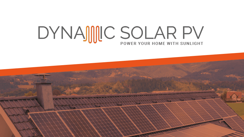
Dynamic Solar – A5 Flyer rollout

Dynamic Solar, a local Dorset Solar Panel and heating company, came to us with a clear goal: reach specific postcodes with their solar panel offers and generate fresh leads. We designed a vibrant, on-brand A5 flyer that really popped, focusing on clear call-to-actions to drive results. Then, we took care of the whole shebang – printing and delivering 15,000 flyers straight to their target areas.
The outcome? A massive influx of leads for Dynamic Solar, and an extremely happy client! It’s always awesome to see a project come together so successfully, and to know we’ve made a real difference to a local business.
“We initially had Amped Up Marketing create a Flyer design and distribution campaign for our solar panel business. The process from start to finish was refreshingly simple, with professional results completely exceeding our expectations. Andy is a friendly expert in his field – and we’ve continued to use Amped Up time and time again. I’d strongly recommend any small business getting in touch with them, for any help with Marketing and Graphic design.” – Liam, Director of Dynamic Solar

McPhail Career Development – Logo redesign

The redesign of the McPhail Career Development logo centres on evolving the brand’s visual language while maintaining its core values of growth and expertise. The original tree, symbolising established growth, has been reimagined as a sapling, representing the dynamic and organic process of career development. This shift highlights the potential for new beginnings and the nurturing support McPhail Career Development provides.

The typography further enhances this approachability. A sophisticated serif font for ‘McPhail’ conveys professionalism and trust, while the softened edges create a welcoming feel. The clean sans-serif font used for ‘Career Development’ complements this, offering a modern and clear presentation. The retention of the deep blue color palette reinforces the brand’s established reputation for reliability and expertise.
Colin McPhail, the founder, expresses his enthusiasm for the new logo, stating, ‘The new logo perfectly captures the essence of our mission. It’s professional yet approachable, reflecting the personalised guidance we offer. The sapling symbol is a brilliant representation of the growth journey we embark on with each client. I’m absolutely delighted with the rebrand!’